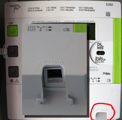
DLMS part 2 - Reading data from an utility meter via HAN/P1 port
Monday, July 29. 2024
My new utility meter has an RJ-12 in the bottom of the unit. Naming of this port is really weird as it is called HAN, P1, HAN/P1 or P1/HAN. In Norway the port is RJ-45 and they call it HAN, for Home Area Network. Original RJ-12 from Netherlands was called P1, which is short for ... P1? I dunno! Just to be safe, manufacturers combine those two. In reality they just add to confusion.
Assuming, one wanted to see in detail how much energy is created by solar panels on the roof and combine that information with data from electricity utility meter, it would be possible to see how much money is being saved with the panels. Having detailed information on how regular household utilized electricity is a nice side effect of that.
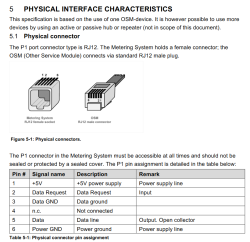
Now that we're in Finland (not Norway, not Netherlands), the regulation is from SESKO and in section 4.6 Physical Interface is as follows:
The RJ12 connector (6P6C connector) is used as the physical interface and the interface meets the requirements of "P1 Companion Standard".
Further, the mentioned document is from Netherlands and describes the physical interface:

Now two things need to happen:
- Utility company needs to enable the P1/HAN -port. The port is disabled by default. Utility company needs to pay license money for each open port to Landis+Gyr.
- Data pouring from the port needs to be read with a suitable piece of hardware. Protocol is M-Bus, a TTL signal.
Given Internet has tons of possibilities, a suitable open-source reader exists: P1IB. All the necessary data is freely available at https://github.com/remne/p1ib. Software, hardware and 3D-printer models for the case. Obviously, there is an option to go buy one pre-built.
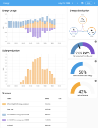
After tinkering with hardware, enabling a MQTT data-pump on both solar panels and utility meter. Setting up a MQTT-broker to receive the published data and a Home Assistant software to have a cherry on top. Final result looks like this:

In Energy-section of Home Assistant, there are number of data visualizations. Top-left bar diagram indicates how much electricity is being consumed by the household. Blue is electricity purhcase from grid with money. Yellow is electricity produced by solar panels. Bottom side, purple, is electricity sold to utility company's grid from solar panels.
Bracket with time 12:00 has hours 11, 12 and 13 in it. As an example, during hour 12 house consumed 0.8 kWh of electricity. Of that 0.61 kWh was solar power (yay! free!) and 0.18 kWh was purchased from utility company (uff! €). However, during that hour solar production was 1,74 kWh, of which 1,13 kWh was returned back to grid. Funny how averages work, there must have been clouds or spike in consumption for the need to purchase more. On the other hand, there were plenty of times where excess energy was available. In theory, I'll get some money out of that excess. Practically: I don't. Transfer in and out costs money to me and all my potential proceeds go to transfer.
Looking at other parts of the visualizations: Obviously, the good thing is I do consume 50% of my own production, making it 42% of all my consumption. What happened after taking the screenshot was the obvious sunset. My solar panels are unable to produce anything, so all my consumed electricyt was from the grid. As a daily record, after sunset hours did increase daily net consumption by couple kWh.
Next up: Now that we know what electricity costs and the rate it flows in and out, it is easy to apply money on top of all this. It should be possible to estimate correctness of initial payback time of solar panel investment.


