StackExchange flair received
Monday, March 11. 2019
Whoa! I finally hit the long awaited 200 point mark in Stack Overflow. The good part about that is, Stack Exchange starts publishing a public badge they'll call "flair". They do this to make it possible for me to publicly boast about my prowess. To get some public boasting going on, my flair looks like this:

All of you Peeping Toms out there, I'll save you couple keystrokes of googling: My  public user profile is at https://stackexchange.com/users/1684769/hqjatu
Blog improvement: Responsive theme
Sunday, March 10. 2019
Going back in the memory lane, back in 2009 Mr. Wroblewski coined up a term "mobile first". At the time pocket computers, or not-so smart phones where a new thing, but booming heavily. First iPad wasn't out there and tablet computing was merely a curiosity. Still Mr. Wroblewski envisioned a future, where most of the web browsing would be done with a mobile device.
To state the obvious: Mr. Wroblewski was not wrong in his statement. His future vision started becoming a reality in April 2015 when Google as the #1 authority on website content, announced they would be demoting pages not being mobile user friendly. In November 2016 Google announced Mobile-first Indexing initiative. In March 2018 they followed up on that and started rolling out mobile-first indexing.
Rougly past 4-5 years this blog of mine has been suffering from this demotion and I really started taking the hit in 2018. Originally I chose this paper-style theme for this blog when I first created it in 2013, and it has been unchanged ever since. Not doing anything about it was an obvious mistake on my part. However, it took a while for Serendipity theme repository to even have properly implemented responsive design themes, so it was impossible for me to change the theme. Still, why would I even want to change the way my blog looks like!
Finally: I chose to improve the theme by making it responsive. In practice, I bootstrapped it with Bootstrap. This is a super-cool project originally created by few guys at Twitter. Read the Wikipedia article about that at https://en.wikipedia.org/wiki/Bootstrap_(front-end_framework). Getting to understand the 12 column grid system takes a while, but when you do the groundwork of arranging page content to rows and columns and realize that you can get six different chunks of display real estate by 1, 2, 3, 4, 6 and 12 columns depending on user's screen size, the results will be amazing! Most of this trickery doesn't even require any JavaScript to run. Adding floating navigation bars and such will require JS, but majority of the goodies work fully on bare HTML/CSS.
So, this is where I stared my journey with:

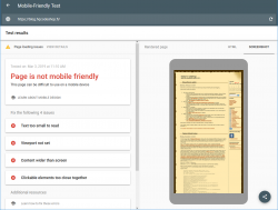
Google Mobile-Friendly Test spits out a lot of grievance from my blog.
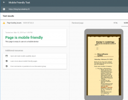
This is the result with this new theme applied:

Oh yeah! Now GoogleBot should be much happier with this one. For those of you who want to play around with this, just go make the browser window very narrow and see the point where screen breaks and drops the right side menu off. To access the goodies on right side menu, a hamburger menu will be added to the top of the page.
GoogleBot tester isn't completely happy about my page, there are some load errors. However, I'm not sure exactly what the load errors are as they're labeled "other". Tons of people in The Net are suffering the same. Warning says:
Page partially loaded
Not all page resources could be loaded. This can affect how Google sees and understands your page. Fix availability problems for any resources that can affect how Google understands your page.
Based on lot of other people's comments found in web, the "errors" are merely warnings and they may or may not reduce the page rank. I'm agreeing with some people commenting, that the test Googlebot smartphone client is using super-short timeouts forcing people to optimize their websites to do as little loading as fast as possible.
The standard disclaimer applies:
If any of you think, that this theme doesn't work properly or I did something wrong. Drop me a comment or go to my Github fork at https://github.com/HQJaTu/additional_themes/tree/brownpaper-r2 and create a new pull request. I'm more than interested in keeping this new theme running optimally.

